
Today the postman brought me four new bottles of ink from the Feline range just released by Tasmania’s Van Dieman’s Ink. I was on a self-imposed ink buying hiatus, but these looked so pretty I decided I would get a few just to see what they were like. The presentation is beautiful; the labels and boxes are guaranteed to appeal to cat lovers, and if you have a fancy for a particular breed, you are likely to find an ink here to match your feline companion.
There are fifteen inks in the range, and the bad news for me—though possibly not for you—is that the majority are shimmering, and thus not useful for me, given the way I use my pens. As a result, choosing which inks to buy was a reasonably straight-forward decision. I chose three inks that I thought would be good, or at least interesting to write with, and then somehow talked myself into Lion’s Roar because (the embarrassing truth is) I liked the lion’s picture on the bottle.
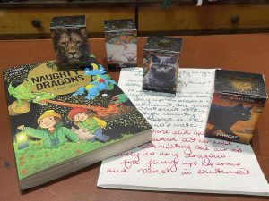
The other inks I bought were Russian Blue, Purr and Tomcat. Have a look at my photos to get a sense of how they look in use. The pens used are a (modern) Conway Stewart 100 with an IB nib, a Graf von Faber Castell Guilloche with a Broad nib, a Caran d’Ache Varius with an italic grind, and an Enceladus from Stephen Just at Just Turnings, fitted with a steel Leonardo Broad nib. The writing sample is done on original Tomoe River paper. The sample text is taken from the first chapter of my most recent children’s book, Naughty Dragons Camp Out!, the fourth book in the Naughty Dragons series. Naughty Dragons Camp Out! was published last week, and you can read more about it here.
Of the four inks, Russian Blue is probably the most interesting and useful for my purposes, which is everyday writing and note-taking, and lots of it. Russian Blue is a rather intriguing colour, shading somewhere between green and grey and blue. It reminds me a bit of an approaching hailstorm, but the exact colour is hard to pin down. For me, the most important thing is that it is legible. It works very nicely in the IB nib, but the colour is strong enough that it would work well in fine pens too, and it is something you could use as a daily writing ink without any qualms.

Purr is dark pink. I have to own up to a pink ink problem: I have far too much of it. In the early 1970s, my mother’s friends in the Women’s Liberation movement told her that it was wrong to stereotype little girls. Pink was thus forbidden fruit during my formative years, with the result that at the age of 59, I am writing this in an office with pink walls and a drawer full of pink ink and fountain pens. Purr is not hugely dissimilar to another Van Dieman’s ink, Pink Radish, from the Harvest Range, which is a great favourite of mine (I’m on my second bottle). Purr is a good, strong pink and I will certainly use it, but there are lots of similar inks out there, and I am not sure I really needed it in addition to Pink Radish.

The third ink is Tomcat. This is a very dark and saturated green-black, but I found it hard to get a decent photograph that shows the colours in it to best advantage. According to the description on Van Dieman’s website, it develops a dark red sheen; I didn’t get this in my writing sample, but did in the swatch. Again, the photograph did not pick this up well, so you’ll just need to trust me when I say it is there. The pen I put this ink into is one I use when I want to write something out nicely; I’d say that this is exactly what it is best for. It would be an excellent ink for writing out poetry; in fact, my first thought was that Tomcat would be a really cool ink in which to transcribe Richard Watson Dixon’s 1861 poem, “The Wizard’s Funeral”. (Everyone needs to know a bit of poetry by heart for testing pens. This is one I often use, along with “Casabianca” and various bits of “A Shropshire Lad”. You get a much better idea of how a pen writes by reproducing the same piece of text, rather than drawing loops and scribbles.) As for daily writing, I am not so sure about this one. Because of its high saturation levels, Tomcat takes quite a while to dry. I am a great believer in blotting paper—there is a reason it was invented—but if you blot this, you’re probably going to spoil the effect. So to sum up: an ink for effect and occasions when you want the ink to make a statement.

Finally, we come to Lion’s Roar. I’m probably not the best judge of a shimmering ink, but the colour of this one is spectacular. It is a gorgeously rich deep red that leans towards the orange/brown tones and it sheens green. The added gold sparkle enhances, but does not overpower it. Lion’s Roar seems to behave quite well in my Enceladus, but the usual shimmering ink guidelines apply—make sure you put it in a pen you can safely take apart to clean, and occasionally rotate the pen while you are writing to keep the shimmer suspended. I like the base colour so much that I would be happy if a non-shimmer version of it was released at a future date. It would be much more useful, because this is the sort of ink I tend to use only at Christmas.
More about the Feline series, including the lovely inks I did not cover can be found on the Van Dieman’s website. And you can buy a copy of Naughty Dragons Camp Out! here.


