As many of you know, a work-related hobby of mine is collecting (and restoring) fountain pens. All my books start out longhand, using fountain pens and notebooks, and in future posts I plan to spend a bit of time explaining why I like to work this way. I am also hoping to write about some of my preferences in pens, ink, paper and notebooks. Since this will probably result in some rather idiosyncratic observations, I am going to point out right up front that I don’t draw, I don’t swatch and I don’t bullet journal. All I do with my pens is write. A lot. I usually go through just under half a litre of ink a year, and although I still buy inappropriate colours (OK, I am a sucker for pale pink), over the years I have developed pretty firm opinions about what makes a good writing ink.
So, what characteristics do I look for in an ink? Well, for my purposes, (and I do emphasise this, because we all have different preferences and ideas), the following questions form a kind of guide:
- Is it legible?
- Does it flow well? Will it keep up with me?
- Does it smudge or feather? Is it sticky?
- Does it make a mess of my pen?
- Does it look interesting on the page?
- Will I want to refill my pen with it when it’s empty?
You will note that in the above list, I do not mention dry times. Reader, I have a secret…sssh…draw close…it’s called…blotting paper.
If you have time to sit watching ink dry on a page before you flip it over, I do not.
Legibility is subjective, but some colours are always going to be easier to read. Blues, greens, blacks, greys, browns and variants thereof, with reds for highlighting are all in heavy rotation through my pens. I also write extremely quickly, and there is nothing more annoying than having a pen that fails to keep up with the thought processes. While there is such a thing as an ink that is too wet (ironically, Diamine Writer’s Blood comes to mind), dry inks are a writer’s nightmare, and inks with sheen, shading, and shimmer are more trouble than they are worth. Strong, clear colours will win every time, but that does not mean ink has to be boring.
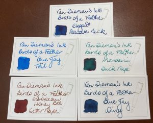
This week, I received several new inks in the “Birds of a Feather” series from Van Dieman’s Ink. Peter and Belinda Rix are the creators of the Uber Ink, Hanging Lake. I will explain another day exactly why Hanging Lake is the only ink I ever bought a Coke bottle full of, but I am a great fan of their work, and am always happy to give a shout out to local manufacturers. The five inks I bought from the set for myself are
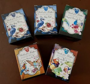
- Blue Jay Wing
- Blue Jay Tail
- Elegant Peacock Neck
- Mandarin Duck Nape
- European Honeybee Eater Nape
The series celebrates different birds from around the world, and I picked these because I thought they would be most practical for my purposes.
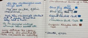
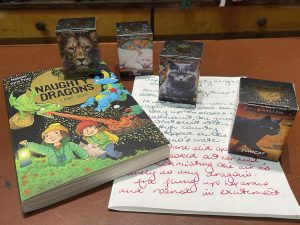
The first three are blue, Mandarin Duck Nape is a lovely rich teal, and European Honeybee Eater Nape is a beautiful and unusual colour, somewhere between red and brown with a subtle greenish sheen. It was the one that really caught my eye when I looked at the range and, as someone who is incredibly fussy about brown inks, I have to say I have been delighted with it. Of the blues, Blue Jay Tail is a bright colour not dissimilar to other inks in my collection (Iroshizuku Ama Iro springs to mind); and the other two are deep and subtle blues that are very good for daily writing and unusual enough to want to use them over and over. Unlike the super-saturated inks in Van Dieman’s Underwater Range (which were beautiful, but probably more suited for artists than people like me) all of my choices from the Birds of a Feather Range have so far been fuss free; they seem to flow well, dry reasonably quickly, and are not smeary or stick. There is some red sheen on Peacock Neck and Duck Nape which you can see on the swatch cards below (please ignore the little bit of seepage in the bottom left hand corner; I put far too much ink on the cards, which I haven’t used before, and in ordinary writing I have not experienced feathering). Have a look at my sample photos and see what you think, and if you would like to buy some for yourself, you can find the whole collection (including many lovely colours I did not buy) on the Van Dieman’s Ink website. Finally, my writing samples for this post came from Lucy’s Book, written by myself and illustrated by Cheryl Orsini, which you can read more about here.